
DC Comics has formally debuted their new corporate logo, so hold your breath and prepare to be amazed....

What? You're not amazed, well maybe these jaunty variations on a theme will make you wet your pants with fanboy glee...

Still dry?
Okay, I admit it, I was seriously underwhelmed by the whole thing. In fact, when I first saw it, this is what I thought of...
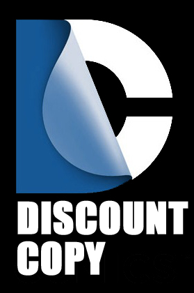
That's right, I thought it was the logo for a place where you go to get photocopies made. This logo has reached incredible heights of banality, that I honestly didn't think were possible.
Now before I get to my point, let's meander a bit and take a moment to look at DC's past logos and see how they compare to the new one.

This logo is from 1949, and it's basic design tells the story of the company. On the top is the name of "Superman" their biggest star, in the center are the initials DC, which stood for "Detective Comics" their first big magazine, and at the bottom is National Comics which was the original name of the company.
It's not particularly inspired, but it's still better than the new logo.

This logo was adapted in the 1970s, and it's still pretty simple, and tells a slightly different story. Instead of just plugging themselves as the home of Superman, DC, which is now officially called DC Comics, it's shilling itself as the home of a whole universe of "super stars." It sort of looks like it belongs on the side of a football helmet, but it's still better than the new logo.
It was soon replaced by this logo...

This logo is not quite as narrative as the last two logos, but it is symbolic. The round shield shape, the stars, the bold blocky letters have an air of martial heraldry, like the sort of logos made up by members of military units during World War 2. It symbolizes heroism, teamwork, and patriotism, which is rather fitting since the foundation of the business is the making and selling of superheroes.
That makes it better than the new logo.

This was the last logo DC had before the new one, and it's still better. The bold streamlined letters, the swooping lines, and the star, symbolize motion, strength, and action.
Pretty fitting for a company that sells superheros. Still better than the new logo.
What does the new logo tell me, once I get past the thought of getting my manuscript photocopied for 5¢ a page and picking up some post-it notes on sale?
Well, it tells me that whoever designed this logo, and the people that approved don't seem to appreciate exactly what DC Comics is supposed to be selling. There's no hint of action, heroism, no dynamism, or excitement. Just one corporation "re-branding" another without much thought about what the corporation is supposed to do. It might as well make widgets.
The third logo is still my favorite.
ReplyDeleteNow for a REAL quandary: how does the new DC logo stack up against Marvel's?
Isn't Marvel's logo just MARVEL in white letters on a red background?
ReplyDeleteEven if it isn't it's still better than DC's new logo.
You're right and... I dunno if it's really an improvement over the new logo.
ReplyDeleteI do think maybe it would have been better had it been reversed, because it would be easier to tell that a letter, partially folded down, is a 'C'.
And why did they change their logo so soon? Looking at the years up there, they seemed to usually let the logos stand awhile before changing.
this logo bears all the stigmata of having been constructed by an artistic design brain trust who wouldn't be caught dead ever doing anything as juvenile as reading comics.
ReplyDelete